I've just stumbled upon this - an article in the Guardian by my mate Johnny Minster, we spent 3 or 4 years together at Barking College of Technology under Brian Hatton and Plymouth College of Art and Design under Bryan Preston, Roger Swingler, Dick Hill and Michael Cranmer. As I recall, we shared a house together for two years and it was his Mum who suggested I had the temperament to become a teacher.
Anyway here it is... https://www.theguardian.com/careers/how-to-become-photographers-assistant
Here's another useful link from Youtube
https://www.youtube.com/watch?v=lLKBB5f96mM
Wednesday, 7 December 2016
Monday, 31 October 2016
Materials, techniques and processes - ideas and things you can do - Mixed media photography.
Do this - Get together paints, pens, pencils, chalks, crayons, biros and any other method to draw onto a 'Support'. The term is usually applied to painting and drawing and refers to the medium onto which you can draw/paint etc. The same term can be used in the context of photography because we too paint onto the surface in different ways - sometimes directly, as in the case of Arnulf Rainer

As part of this process we as the 'Artist' have to explore the use of how the 'Mark-making' tools work in conjunction with the 'Support' and make judgements as to whether the combination of both is successful. You have access to a number of ways in which you can produce your images - digitally and traditionally. Some of you may have access to additional methods such as 'Ink Jet' printers at home so have a larger range of potential supports for your experiments.
With a broad selection of mark-making materials...
HB pencil
2 B Pencil
4 B Pencil
Biro
High-lighter pens
Chalk
Charcoal
Water-colour paint
Goache paint.
Poster paint.
Oil paint.
Acrylic paint.
Coloured pencils
Conte pencils
Water-colour pencils
Fine-liners
OHP pens
Permanent markers
Dry wipe board markers
Get all of the supports that you have got access to... Search out or use the hyperlinks here to find more information on the characteristics and properties of these papers. Record this information with samples of the different papers/supports...
Photo-copy paper more here
Photo-copy card (CRU)
Ink Jet paper from home
Kentmere VC Select
And try all the different mark making materials (pens/pencils/paints) on the surface. Number each one and then write up your observations of how they work in conjunction with the support. Again describe the characteristics of the materials - thick, runny, oily, fine, watery, translucent, opaque etc. Does it react with the paper, or sit on top of the paper, does it rub off or is absorbed, is it neat or untidy, does it look like it has potential or does it look unprofessional.

Watch these videos here

As part of this process we as the 'Artist' have to explore the use of how the 'Mark-making' tools work in conjunction with the 'Support' and make judgements as to whether the combination of both is successful. You have access to a number of ways in which you can produce your images - digitally and traditionally. Some of you may have access to additional methods such as 'Ink Jet' printers at home so have a larger range of potential supports for your experiments.
With a broad selection of mark-making materials...
HB pencil
2 B Pencil
4 B Pencil
Biro
High-lighter pens
Chalk
Charcoal
Water-colour paint
Goache paint.
Poster paint.
Oil paint.
Acrylic paint.
Coloured pencils
Conte pencils
Water-colour pencils
Fine-liners
OHP pens
Permanent markers
Dry wipe board markers
Get all of the supports that you have got access to... Search out or use the hyperlinks here to find more information on the characteristics and properties of these papers. Record this information with samples of the different papers/supports...
Photo-copy paper more here
Photo-copy card (CRU)
Ink Jet paper from home
Kentmere VC Select
And try all the different mark making materials (pens/pencils/paints) on the surface. Number each one and then write up your observations of how they work in conjunction with the support. Again describe the characteristics of the materials - thick, runny, oily, fine, watery, translucent, opaque etc. Does it react with the paper, or sit on top of the paper, does it rub off or is absorbed, is it neat or untidy, does it look like it has potential or does it look unprofessional.
Watch these videos here
https://www.youtube.com/watch?v=YnDaY14SRpM Nudity warning
To see the potential for some of these techniques.
To see the potential for some of these techniques.
Wednesday, 4 May 2016
Light - identifying it, writing about it as a technical aspect of your work in college projects.
Photography... It's all about the light, if there is no light there is no photograph. If you're at college studying photography, you're studying light as well and with 2 years of work free study surrounded by lecturers that are experts in the art of light you need to be leaving college with some basic knowledge of light.
It's usually the case on a level 3 course be it A-Level, UAL or BTEC there'll be some requirement at some point where you'll need to discuss your use of light and why you've made the choices that you have with regards the light.
So what decisions and knowledge should you identify when writing about it, analysing it and planning it?
(1). What is the light source and what are characteristics of that particular source. If it's an artificial source, is it trying to recreate something in nature... Sunlight or moonlight, reflected light, scattered light, fire light, dappled light, diffuse or point light?
(2). Direction - where's it coming from and why, why are you choosing to shoot in that particular light? What is it doing for your subject, is it moody, emotive, dramatic, objective, neutral?
(3). Does it flatten the subject or does it model the subject e.g. pick up the shape, form and texture, do you want it to do one or the other, if so why?
(4). Refracted, diffuse, reflected, specular, point?
(5). If it's an artificial facsimile of a natural form of light, how have you achieved it and how close have you been able recreate its properties and characteristics - be explicit in your explanations, draw floor plans and photograph the set-up.
(6). Colour of light http://www.cambridgeincolour.com/tutorials/natural-light-photography.htm
(7). Lighting equipment - what did you use, why did you use it what are its pro's and cons.
(8). Inverse square law and its application in photography - how does it help you and why do you need to know about it, how have you used it?
(9). Reflected light - controlling light in the studio using zones and inverse square law.
(10). Artificial light sources, their characteristics and properties.
(11). Studio flash, modifiers, dishes, soft boxes, snoots, diffusing screens, reflectors, umbrellas all the equipment and its characteristics and properties.
(12). Studio space, heights, distances, widths and walls... why?
(13). Influence - whose lighting technique and style are you borrowing from, your analysis of their approach.
(14). Deconstructing and analysing other people's lighting using visual clues.
(15). Ratios - between highlight and shadow, masculine and feminine lighting.
(16). Masters of lighting - classic lighting techniques used by painters.
That's some of the easy stuff.
Use these prompts above and your notes from over the first year when all of this was covered, discussed and used in practice. (That's if you're on one of the courses I deliver).
Sunday, 6 March 2016
Prompts - The background in the image
The background in an image is important. Sometimes the background can say as much about the person as their clothing and their facial expressions, it's often a part of the narrative of the image.
Back in 1988 when I was studying photography I was interested in Stock Photography and I read a book (Title and author I can't recall) on the subject. One of the most Important things I learned from the book and still use today was a formula that can be used when you're shooting images for picture editors with the intention of securing sales. The formula - which I still teach is...
Person + background + involvement + symbol = picture
All of the components are important, but the background element is very important.
For example have a look at this image here of my son...
You're told "Go and take a picture of the 14 year old kid that took six wickets for 15 runs in an adults cricket match". You come round my house, you look around and you see this wall and you shoot this...
 If we examine the image and start deconstructing it what can we see and what can we start making assumptions about if we analyse it? (See prompts in the side bar).
We're concerned with the background at the moment, but we can't ignore the rest of the image. What can we see...
 This image represents an improvement in that there's some visual clues although they're a little esoteric the style and colour of the shirt and the inclusion of the Slazenger brand name and logo indicates an association with a sport. If you have some knowledge of sport you might be able to recognise the kit as being related to cricket and the image combined with the text now makes a little more sense, but the plain wall doesn't.
 This is the image your picture editor would liked for you to come back with if you couldn't get an action shot (Or a smiley version). The background in this image albeit still fairly esoteric would be recognisable immediately when combined with the text relating to story "14 year old boy takes 6 wickets for 15 in an adult crickets match" because of the detail on the background - the grass and the pavilion. The ball though is probably the clincher to the narrative as it's the 'Symbol'.
Could it have been improved even more? Could the background have been even more 'Crickety'?...
 Something like this?
This image uses the formula mentioned earlier...
Person + background + involvement + symbol = picture.
Backgrounds therefore are important as they are integral to creating the narrative. You can simplify them and then make the narrative ambiguous.
Simple backgrounds e.g. a solid colour or black and white still have connotations that can be read and made sense of. Alternatively a simple background focuses the attention on the subject and in many instances the inclusion of the simple white, grey or black background is of little significance. But these colours can also be made sense of in complex ways -
White http://www.bourncreative.com/meaning-of-the-color-white/
Grey http://www.bourncreative.com/meaning-of-the-color-grey/
Black http://www.bourncreative.com/meaning-of-the-color-black/
Back in 1988 when I was studying photography I was interested in Stock Photography and I read a book (Title and author I can't recall) on the subject. One of the most Important things I learned from the book and still use today was a formula that can be used when you're shooting images for picture editors with the intention of securing sales. The formula - which I still teach is...
Person + background + involvement + symbol = picture
All of the components are important, but the background element is very important.
For example have a look at this image here of my son...
You're told "Go and take a picture of the 14 year old kid that took six wickets for 15 runs in an adults cricket match". You come round my house, you look around and you see this wall and you shoot this...

We're concerned with the background at the moment, but we can't ignore the rest of the image. What can we see...
- He's a white westerner.
- From the clothes and the haircut we can see that he's not destitute and that he's possibly either working class or middle class.
- He's fairly tanned and the environment looks warm, so he probably lives in a temperate area of the world or warmer.


Could it have been improved even more? Could the background have been even more 'Crickety'?...

This image uses the formula mentioned earlier...
Person + background + involvement + symbol = picture.
Backgrounds therefore are important as they are integral to creating the narrative. You can simplify them and then make the narrative ambiguous.
Simple backgrounds e.g. a solid colour or black and white still have connotations that can be read and made sense of. Alternatively a simple background focuses the attention on the subject and in many instances the inclusion of the simple white, grey or black background is of little significance. But these colours can also be made sense of in complex ways -
White http://www.bourncreative.com/meaning-of-the-color-white/
Grey http://www.bourncreative.com/meaning-of-the-color-grey/
Black http://www.bourncreative.com/meaning-of-the-color-black/
Saturday, 5 March 2016
Putting together your practical work
Old and out of date.
New for 2020 - https://www.youtube.com/watch?v=9JK4VfqXBzY&t=975s
What do you write and what do you include when putting together a response to your practical work?
Here's a suggestion as to how you might go about it, needless to say adapt to your own methods if you don't like all of it, but if you're completely lost as to what to do and write, this may offer a solution. One of the key points of this approach is the use of a display folder, as it means at any point you can edit and remove pages to improve the folder in any way.
This method is ideal for your work at the developmental stages - test shoots, trials and experiments. Remember your work must be developed over a series of stages as your work out what you're going to do for the final product.
 The Blue section should be your 'Planning' what you intend to do, your resources, where, when and who? Needless to say the more details the more indicates your levels of planning and organisation. The Red section is also 'Planning' but more visual - a lighting plan, showing where the light sare and included a key to explain what the components are. Generally most photography courses want 'Visuals' diagrams and sketches and if you can include these that'll be great.
The Green section is examples of images from the shoot, you can use contact sheets/thumbnails, but I've made mine slightly bigger and selected some of the images that were typical from the start of the shoot rather than all of the images, showing that I was working with poses. The text in this section deals with the colour of the background and the poses and the decisions I was making as the shoot progressed. Keep the details simple at this stage, just write about what you were trying to achieve or was expecting to happen.
Page 2 (below).
 Top left - more images from the shoot either selected ones or the whole contact sheet, it's up to you, showing how the shoot comes together and ideas are developed. Right-hand side ringed in Green images of how you've set up the lights. Always step back and shoot images of your light set ups either with the camera you're using or a phone or whatever is at hand. This gives you the opportunity to add details about the equipment and is good for future reference if you use the lighting again and want to replicate the lighting.
Ringed in Blue is the image that influenced the shoot with the lighting we're trying to replicate. In this instance I've not done a lot of research into the image, but potentially you could find out who shot it and do some research into the photographer and possibly add additional images from the same series. I've written about the light and the exposure, but more could be added relating to the fact that it's high-key and the composition and a lot more (See prompts in side bar).
Page 3

Page 4
On this page, I've chosen what I felt was one of the better shots and I've taken the time to reproduce it at A3 set in a white surround. You could if you wished have it printed as a full bleed image covering the whole page. The choice is yours.

New for 2020 - https://www.youtube.com/watch?v=9JK4VfqXBzY&t=975s
What do you write and what do you include when putting together a response to your practical work?
Here's a suggestion as to how you might go about it, needless to say adapt to your own methods if you don't like all of it, but if you're completely lost as to what to do and write, this may offer a solution. One of the key points of this approach is the use of a display folder, as it means at any point you can edit and remove pages to improve the folder in any way.
This method is ideal for your work at the developmental stages - test shoots, trials and experiments. Remember your work must be developed over a series of stages as your work out what you're going to do for the final product.

The Green section is examples of images from the shoot, you can use contact sheets/thumbnails, but I've made mine slightly bigger and selected some of the images that were typical from the start of the shoot rather than all of the images, showing that I was working with poses. The text in this section deals with the colour of the background and the poses and the decisions I was making as the shoot progressed. Keep the details simple at this stage, just write about what you were trying to achieve or was expecting to happen.
Page 2 (below).

Ringed in Blue is the image that influenced the shoot with the lighting we're trying to replicate. In this instance I've not done a lot of research into the image, but potentially you could find out who shot it and do some research into the photographer and possibly add additional images from the same series. I've written about the light and the exposure, but more could be added relating to the fact that it's high-key and the composition and a lot more (See prompts in side bar).
Page 3

This section is potentially the part where you're going to pick up loads of credits that meet the criteria. The way we advise you to do this is to structure the response to your own work using he Gibbs Reflective Practice Model which works with either 5 or 6 prompts (I've missed out no.5 "Conclusion" in this instance). Reflecting on your work making sense of it, criticising it with the intention of identifying areas of strength and weakness is an essential aspect of your work. Making sense of it and analysing it is essential too and Gibbs steers you through the process in an orderly manner and is a dream for your lecturers/assessors to mark!
Most of the sections can be relatively short and concise, the parts you do want to focus on and produce more written material around are the analysis and planning sections. The planning part leads you into the next round of work.
Page 4
On this page, I've chosen what I felt was one of the better shots and I've taken the time to reproduce it at A3 set in a white surround. You could if you wished have it printed as a full bleed image covering the whole page. The choice is yours.

I would advise as when you produce these final shots you do so at the best quality you can stretch to and keep the approach that you use consistent.
* Note (For my students for 5135 - Fashion promo and WN25) if you do this as you go along and you engage with the process fully you should end up with a pretty useful folio of images as we'll be using some really top quality lighting techniques. The images will be massively improved if in each session your models are styled appropriately. I had to rush this example so wasn't able to get hold of a blonde model and make the images as high-key as the Kate Mosss Vogue cover.
Don't like my approach? Have a look at these here - some of the best from all around the world.
Sunday, 28 February 2016
The Prompts - Responding to and writing about images "Body langauge and facial expressions".
This is one of the easier prompts that can be written about when analysing and deconstructing images of people. We're almost all aware of how people communicate their feelings through their facial expressions and body language, so the way that we incorporate this aspect of making images has a significant impact on the way that the image is perceived. Similarly it's probably one of the most productive options when using the prompts to deconstruct and analyse images.
 When doing this we can't discount the surrounding factors - backgrounds, props, clothing, body language, semiotics, location, relationships and accompanying text. All of this is rich in potential meaning allowing you write and comment about the images. What do the expressions or body language tell us about the person and their environment, how has the photographer used this aspect of their photography? Is it intentional, natural or constructed? How significant is the facial expression or body language, is it subtle or is it a massive part of the image narrative?

How to put together your research for a photography project
Here's my current thoughts and suggestions as to putting together a photography research project.
It's an essential part of your studies on any level 3 photography courses (UAL, BTEC or A-Levels) that you study historic and contemporary photographers. Over the years I've suggested all sorts of different ways of doing it, but this is my current suggestion and I reckon it's the most efficient and easiest way I come up with and I'd like to think that our students will recognise it and adopt it.
Almost without exception the units and assignments on photography courses require that you put together research prior to shooting your images. Your images need to be informed or influenced by the work of other 'Significant' photographers. We advise that your starting point for finding such photographers is the British Journal of Photography, books such as 'Photography The Whole Story' or my list of contemporary and historic photographers which you can find here . It's important that you list your sources in a bibliography and all examination bodies and lecturers like to see and sometimes require that you identify the use of books.


 There are number of reasons for this. (a). You can edit the work easily, so many students change their minds about the way they work and produce work out of order leaving blank pages with the intention of filling them in later and then they run out of time. With these folders you can swap and change and omit work easily/ (b). Most colleges have photocopy machines with A3 paper and you're probably allowed to take a few sheets of paper if you ask your lecturers and this reduces costs. (c). I recommend as below you use one side of a two page spread almost exclusively for the images you find associated with the photographer you're researching and on the adjacent page a key image about A5 size surrounded by your written work. (d). When you hand in your finals they look impressive as A3 images or surrounded by a white mount affect when printed as A4's on an A3 mount. If you spend the time and money acquiring high quality finals as you complete each of your projects these can be removed and added to a final portfolio at the end of the year.


It's an essential part of your studies on any level 3 photography courses (UAL, BTEC or A-Levels) that you study historic and contemporary photographers. Over the years I've suggested all sorts of different ways of doing it, but this is my current suggestion and I reckon it's the most efficient and easiest way I come up with and I'd like to think that our students will recognise it and adopt it.
Almost without exception the units and assignments on photography courses require that you put together research prior to shooting your images. Your images need to be informed or influenced by the work of other 'Significant' photographers. We advise that your starting point for finding such photographers is the British Journal of Photography, books such as 'Photography The Whole Story' or my list of contemporary and historic photographers which you can find here . It's important that you list your sources in a bibliography and all examination bodies and lecturers like to see and sometimes require that you identify the use of books.


Anyway down to the process. We'll assume that you take the correct approach to your research and research all the time using the right methods.
(1). This is a visual subject and you need to make your work look as though you're interested in images. Therefore the balance between written work and the use of images in your research should be 50/50.
(2). I advocate the use of A3 display folders...
 There are number of reasons for this. (a). You can edit the work easily, so many students change their minds about the way they work and produce work out of order leaving blank pages with the intention of filling them in later and then they run out of time. With these folders you can swap and change and omit work easily/ (b). Most colleges have photocopy machines with A3 paper and you're probably allowed to take a few sheets of paper if you ask your lecturers and this reduces costs. (c). I recommend as below you use one side of a two page spread almost exclusively for the images you find associated with the photographer you're researching and on the adjacent page a key image about A5 size surrounded by your written work. (d). When you hand in your finals they look impressive as A3 images or surrounded by a white mount affect when printed as A4's on an A3 mount. If you spend the time and money acquiring high quality finals as you complete each of your projects these can be removed and added to a final portfolio at the end of the year.
So this is the way I would suggest that you compile your work

So this above would be an A3 double page spread. The recommendation is that you do make it visual and have it so that 50% of the work is made up of images.

So the image above is the 'Image page'. When you find your initial or key image you'll probably find associated images collect them all together as files and then print them off - print off about 8 or 9 approx. A6 in size. If you use a PC (proper computer) in windows select four images to print and windows will neatly nest four images on the page to print at a time onto A4.
At the top of the page you'll see a couple of images that are associated with the Testino images by virtue of the pose. The pose looks to be inspired by Jan Van Eycks 'Arnolfini Portrait' and interestingly I noticed that it also was similar to David Bailey's photograph from the 1960's of Jean Shrimpton. It maybe that both photographers were inspired by the work of Jan Van Eyck and realising that this image has stood the test of time for several hundreds of year was a pretty safe bet to use as stylish pose? Where possible and as much as possible look for these kind of links and identify them (This is the reason you're encouraged to look at images constantly).
Include on this page if you wish some written work. As I developed this approach I started to use this page to write up my initial observations and immediate thoughts about the images. On the adjacent page below I then wrote up the facts rather than opinion and speculation.

Make sure both pages (Ringed Blue) have a big clear title including the name of the work/images. From your initial research where you collate all of the images pick a key image that you feel you can write about - possibly the first one you noticed or the one with the most interesting features. * As you collect the images from the website, save some of the HTML addresses to include in your bibliography. Also look at the website in case there's some written content that gives you more information about the images. If there's not then start to look around for written content that is associated with the artist or the images. The best way to do this is type in the name of the photographer pre-fixed with "Interview with" so I would have tried a number of searches using...
Interview with Mario Testino
Vogue masterclass September 2011
Vogue master class interview Mario Testino
I'd have repeated the same searches on Google but with a video search enabled. This generally brings up some really good resources and it was through watching the video of Testino shooting a Japanese shoot for Vogue that I identified his own research methods and the equipment and lighting he uses on set. All very much worth looking at.
Two interviews is generally enough, along with videos and the original sources from the BJP to get enough information to write about the image/s using the prompts (Circled in Red). If you're struggling generate written responses to the images use these prompts (see the sidebar to the write of this blog page).
Try and generate for your Final Major project at least ten pieces of research like this independently. You'll get the chance to practice this in class with help, but to push the work on to Merit level you need to be seen generating your own research more specific to your own needs.
A very similar approach can be used in conjunction with your practical sessions and another video and series of images will be added after I've made the resources.
Why research photographers all the time and why use the British Journal of Photography and books?
Since the advent of digital photography the studying of photography at college has had to adapt and change. Prior to digital when we all used to have use film it was difficult to do the basics such as make an exposure that was correct, focus the image so that it was sharp and make choices about what films to use. It would be the case that most people would shoot a roll of film and to be really brutal 30 of the 36 frames would be appallingly bad. So when you went on a course a significant part of the teaching and learning was around these basics. Therefore the other aspects of the course - visual language, historical context... the more academic components had a lesser significance.
Then 'Auto-focus' and digital came along and the whole thing got a lot easier. You only have to go on-line now and you'll find gazillions of images that are well-exposed and sharp, every numpty on the planet can now do what used to take some people a life-time to do. One of my students made the point...
"So that means all the crap that used to be hidden away in shoe boxes and family albums is now all over the internet... how on earth are we supposed to separate the two"?
Well, that's one of the things we aim to teach you - how to research properly and the bottom line is keep it simple and only source your photographers from journals such as the British Journal of Photography and books such as Photography The Whole Story - (Juliet Hacking and David Campany).
Things have changed...
So now when you're at college, one of the key things you need to do alongside learning how to make pictures is learn about photographers... Study photographers and Photography. Why are images made, what purpose do they serve, how do they communicate to their audience, who is their audience, how is visual language used to communicate the message and how do we generate ideas and concepts to produce something that is fresh, new and informed.
So at the end of the course one aspect of your learning is that you should be able to confidently speak about your images explaining what and who they are influenced by, and how you use visual language to communicate the message within your image/s. Your images unlike all the millions on Google images will be about something rather than of something your images will be rich in content and informed by the work of others.
The way this is done is through the study of other significant photographers and your first port of call for such study to be affective is journals such as the British Journal of Photography or Hotshoe. You are strongly advised to subscribe to the BJP whilst on the course and use it as the starting point of your research and studies. Make sure you compile bibliographies of your sources and include books and journals.
Saturday, 27 February 2016
The Prompts - Responding to and writing about images "Meaning and message".
For this one you're looking to identify what the images are about and what they are trying to convey - what is the meaning and the message within the image/images?
If you're accessing the right kind of sources for your research - journals such as the British Journal of Photography or books, the chances are you're going to be able to get a sense of the meaning behind the images because you're looking at research material where this aspect of the photography is discussed and identified.
When you're looking at images some of the key questions you need to be asking is what are these images about and what are the images trying convey? It's easy to identify what they're of, but the deeper questions are more complex and difficult to identify what the meaning is.
The process you should adopt should be one of initially offering a suggestion as to what the images could be about. But, then you must do the research and look for reviews and interviews and try and ascertain the facts. Generally in interviews the photographer will be asked about and will explain the meaning behind the images. Another good source for such information is the photographers own websites. Look for the specific body of work or series of images and they'll be accompanied by an introduction and explanation to the work. Look also for links to reviews on the photographers website, have a look through these too.
The Prompts - Responding to and writing about images "Influence and connections".
Identifying the influence of the work your researching is another of the really important parts of your research process.
Probably the most effective way of finding this information is to search using interviews. Once you've found the photographer or the work that you are going to use as a part of your research initially using journals or books (Remember to compile your bibliography as you go), then use the internet once you have the photographers name. In your search pre-fix the photographers name with 'Interview'...
 We would always advise you to find a minimum of two different interviews or articles in conjunction with your research. Usually, irrespective of who asks the questions this important aspect is covered, almost every interviewer will ask "Who are you inspired by" or "Who are you influenced by"?
Check Youtube, Vimeo, Dailymotion and other video websites for video interviews.
Once you've found the information...
Find images of the work the that photographer has been inspired by. If for instance you had researched Hans Van Der Meer in one of his interviews he gives a specific example of who inspires his Football pitch series...
Hendrich Avercamps Skaters

Making these connections and doing this additional layer of research is absolutely essential if you're looking to attain higher grades. This secondary layer only really requires that you include images and then annotate the additional 'Historic' image in terms of what you recognise as being similar in the work.
This broadens your knowledge beyond photography and identifies the historical context. Furthermore it demonstrates that photographers use historic images as key reference points for their own work.
Probably the most effective way of finding this information is to search using interviews. Once you've found the photographer or the work that you are going to use as a part of your research initially using journals or books (Remember to compile your bibliography as you go), then use the internet once you have the photographers name. In your search pre-fix the photographers name with 'Interview'...

Check Youtube, Vimeo, Dailymotion and other video websites for video interviews.
Once you've found the information...
Find images of the work the that photographer has been inspired by. If for instance you had researched Hans Van Der Meer in one of his interviews he gives a specific example of who inspires his Football pitch series...
Hendrich Avercamps Skaters

Making these connections and doing this additional layer of research is absolutely essential if you're looking to attain higher grades. This secondary layer only really requires that you include images and then annotate the additional 'Historic' image in terms of what you recognise as being similar in the work.
This broadens your knowledge beyond photography and identifies the historical context. Furthermore it demonstrates that photographers use historic images as key reference points for their own work.
The Prompts - Responding to and writing about images "Composition".
As soon as you're visually aware as a child you'll start to see images... On television, on computer screens, in newspapers, books and magazines and you'll be presented with images that generally conform to the rule of thirds. If you're still unsure what the rule of thirds is and how it's used in photography and paintings - type 'Rule of thirds' in Google and you'll see thousands of examples.
Generally when I initially explain it I use as an example one of Thomas Ruffs deadpan portraits.

These image conventional compositions with the person sitting in the central third with the eyes falling on the top third intersection. Look through historical paintings and most portrait photography these conventions generally apply. Given a camera and told to take a photograph someone - most people will apply these rules. So when deconstructing your research images and analysing them, this is one of the basic things you can discuss in your work. Do the images you're looking at stick to these conventions or break the rules? If the image doesn't conform to the rule of thirds - why do you think it doesn't - what is the photographer trying to do?
Think about the space that's possibly been created, think about the use of the image - is the space there to provide space for text perhaps?
Breaking the frame
Look at your research images and look at the key subject in the image or the main components - do any of them break the frame or are all the elements of the image contained nicely within the frame? If they do break the frame as in the sheep here in this famous painting by William Holman Hunt 1852 "Strayed Sheep" at Fairlight in Sussex. Why?
 A lot of fashion Photography despite the fact that it is constructed and planned includes this aspect of composition - why? Look at fashion images and you'll see limbs and parts of bodies cut off by the frame of the image - do you think this right or wrong - does it matter, do the limbs need to be in the image? Are there rules for instance when you shoot someone standing up about where you should cut through their legs when shooting the image as a 2/3rd or 3/4 length portrait?
Negative space
When and why might you leave space in a picture? Why do we shoot portraits as upright compositions, why is that the right way? Similarly why are most landscapes horizontal - and what if we use a square format camera - how does that effect the composition and the balance of the image? What are your thoughts on the matter? See this article here.
Look at the images that you're researching or analysing and discuss them in these terms.
How big in the frame?
Looking at the image what can you say about the way the 'Subject' is framed, is it close or far away - why? Would it affect the way that we read the image and make sense of it if the subject was closer or further away. What is the relationship between the subject and the background or surrounding subjects?
People -
If there is more than one person in the frame - how have they been composed in relation to each other? The space between the people - what does it suggest about their relationship?
Viewpoint -
Where has the photograph been taken from - again this is very significant when it's in conjunction with the image of people. Has the photographer shot the image on the same eye-level as the subject? How does this affect the reading of the image - what does it suggest about the relationship between the photographer and the subject?
What if the photographer is higher than the subject - how does this affect the psychology of the image and the opposite... the photographer is lower than the subject? All of these things have a very significant bearing on the way the images are perceived.
Generally when I initially explain it I use as an example one of Thomas Ruffs deadpan portraits.
These image conventional compositions with the person sitting in the central third with the eyes falling on the top third intersection. Look through historical paintings and most portrait photography these conventions generally apply. Given a camera and told to take a photograph someone - most people will apply these rules. So when deconstructing your research images and analysing them, this is one of the basic things you can discuss in your work. Do the images you're looking at stick to these conventions or break the rules? If the image doesn't conform to the rule of thirds - why do you think it doesn't - what is the photographer trying to do?
Think about the space that's possibly been created, think about the use of the image - is the space there to provide space for text perhaps?
Breaking the frame
Look at your research images and look at the key subject in the image or the main components - do any of them break the frame or are all the elements of the image contained nicely within the frame? If they do break the frame as in the sheep here in this famous painting by William Holman Hunt 1852 "Strayed Sheep" at Fairlight in Sussex. Why?

Negative space
When and why might you leave space in a picture? Why do we shoot portraits as upright compositions, why is that the right way? Similarly why are most landscapes horizontal - and what if we use a square format camera - how does that effect the composition and the balance of the image? What are your thoughts on the matter? See this article here.
Look at the images that you're researching or analysing and discuss them in these terms.
How big in the frame?
Looking at the image what can you say about the way the 'Subject' is framed, is it close or far away - why? Would it affect the way that we read the image and make sense of it if the subject was closer or further away. What is the relationship between the subject and the background or surrounding subjects?
People -
If there is more than one person in the frame - how have they been composed in relation to each other? The space between the people - what does it suggest about their relationship?
Viewpoint -
Where has the photograph been taken from - again this is very significant when it's in conjunction with the image of people. Has the photographer shot the image on the same eye-level as the subject? How does this affect the reading of the image - what does it suggest about the relationship between the photographer and the subject?
What if the photographer is higher than the subject - how does this affect the psychology of the image and the opposite... the photographer is lower than the subject? All of these things have a very significant bearing on the way the images are perceived.
Thursday, 25 February 2016
Film rebate - film edge
Who made using the film edge (Rebate) in photographic prints a trend?
I was born in 1960, so lived through that decade and subconsciously picked up on the conventions that connote classic 1960's photography. During the period I would have heard of and seen the work of David Bailey despite the fact that at that time my interest in photography was minimal.
Over the years this perception of what a classic 1960's image looks like, seems to have been reinforced and for me it includes a series of conventions that when combined are definitely of that era.
As a lecturer in photography I have introduced an assignment for our level 3 students where they have to conduct a 1960's fashion/portrait shoot using those same conventions. I would argue that the visual language of the images is unmistakably of that period if most of the conventions are adopted in the construction of the image. Needless to say the styling, poses and choice of location and props finishes the image off leaving the viewer in no uncertain terms that what they are looking at is a 1960's pastiche.
These image conventions include the following
(1). The use of a classic film type such as Kodak Tri-x, FP4 + or HP5+.
(2). If shot in the studio - simple white or grey background, the white background being allowed to fall off to a grey or lit separately to create a white background.
(3). The use of a 6x6cm format camera such as a Mamiya C330, Hassleblad, Bronica SQA or Rolleiflex.
(4). Simple studio lighting - a medium reflector dish set-up in the way that Bailey would have used, or point light with a spill-kill and minimal fill-in dependent on whether the model was male or female.
(5). Strong compositions, again using Bailey as the inspiration.
(6). Print the images punchy with good to exaggerated contrast.
(7). Print with the film edge/rebate creating a border around the image including the film type details and for realism - scratch numbers into the rebate to indicate which neg is to be printed.
Most of these details are to be found in books and on-line in various places with regard trying to figure how to create a 1960's pastiche, but the one that is never mentioned is No.7 the one that relates to the use and inclusion of the film edge/rebate.
As I said - this is my perception and it is not set in granite. What I do know and have discovered is that this isn't exclusive to David Bailey and that before him there are at least two of the great photographers using the same technique...
Irving Penn

 As you can see here, both these images from the 'Corner' series were printed with the inclusion of the rebate (Black film edge), both shots were made in the 1940's. The top image being Marlene Dietrich from 1947 and Mrs Rhineland-Stewart from 1948.
After Penn in 1957, Richard Avedon (below) conducted a famous shoot featuring Marilyn Monroe which is owned by the Museum of Modern Art. This too (well before Bailey) features the inclusion of the border, along with the printed numbers and name of the film. In addition there's scruffy scratched figure which can't be made out, but is probably there to indicate which is the preferred negative on the strip of film.

If we research using the internet you'll find variations of both the Penn and Avedon images and they don't always include the rebate. I personally don't have any hard-copy books that have either sets of these images in, so I can't ascertain whether when published previously with the permission of the photographers or their estate their were instruction to always include the rebate? The MOMA image does have the rebate and the sense I therefore have is that it's an integral part of the images visual language and design... Avedon would have possibly insisted that the image be reproduced with the film edge?
Irving Penn on the other hand or at least the Museum of Chicago seem to be a little ambiguous about the inclusion or exclusion of the rebate (See here) so are we to conclude that the film edge was less significant to Penn?
Then along comes the 1960's and the break- through of the working classes into a world that was primarily dominated by the middle classes - Fashion Photography. To me, there then seems to be a proliferation of the use of the film edge in the final prints especially when displayed in galleries.
Interestingly in the video here we can see the now legendary 'Box of Pin-ups' being looked at and there's no use of the rebate whatsoever, yet the images include those that you will see regularly replicated on the internet with the inclusion of the rebate. (30 mins into the video).

To be continued...
Similarly to the other examples I've loo
I was born in 1960, so lived through that decade and subconsciously picked up on the conventions that connote classic 1960's photography. During the period I would have heard of and seen the work of David Bailey despite the fact that at that time my interest in photography was minimal.
Over the years this perception of what a classic 1960's image looks like, seems to have been reinforced and for me it includes a series of conventions that when combined are definitely of that era.
As a lecturer in photography I have introduced an assignment for our level 3 students where they have to conduct a 1960's fashion/portrait shoot using those same conventions. I would argue that the visual language of the images is unmistakably of that period if most of the conventions are adopted in the construction of the image. Needless to say the styling, poses and choice of location and props finishes the image off leaving the viewer in no uncertain terms that what they are looking at is a 1960's pastiche.
These image conventions include the following
(1). The use of a classic film type such as Kodak Tri-x, FP4 + or HP5+.
(2). If shot in the studio - simple white or grey background, the white background being allowed to fall off to a grey or lit separately to create a white background.
(3). The use of a 6x6cm format camera such as a Mamiya C330, Hassleblad, Bronica SQA or Rolleiflex.
(4). Simple studio lighting - a medium reflector dish set-up in the way that Bailey would have used, or point light with a spill-kill and minimal fill-in dependent on whether the model was male or female.
(5). Strong compositions, again using Bailey as the inspiration.
(6). Print the images punchy with good to exaggerated contrast.
(7). Print with the film edge/rebate creating a border around the image including the film type details and for realism - scratch numbers into the rebate to indicate which neg is to be printed.
Most of these details are to be found in books and on-line in various places with regard trying to figure how to create a 1960's pastiche, but the one that is never mentioned is No.7 the one that relates to the use and inclusion of the film edge/rebate.
As I said - this is my perception and it is not set in granite. What I do know and have discovered is that this isn't exclusive to David Bailey and that before him there are at least two of the great photographers using the same technique...
Irving Penn


After Penn in 1957, Richard Avedon (below) conducted a famous shoot featuring Marilyn Monroe which is owned by the Museum of Modern Art. This too (well before Bailey) features the inclusion of the border, along with the printed numbers and name of the film. In addition there's scruffy scratched figure which can't be made out, but is probably there to indicate which is the preferred negative on the strip of film.

If we research using the internet you'll find variations of both the Penn and Avedon images and they don't always include the rebate. I personally don't have any hard-copy books that have either sets of these images in, so I can't ascertain whether when published previously with the permission of the photographers or their estate their were instruction to always include the rebate? The MOMA image does have the rebate and the sense I therefore have is that it's an integral part of the images visual language and design... Avedon would have possibly insisted that the image be reproduced with the film edge?
Irving Penn on the other hand or at least the Museum of Chicago seem to be a little ambiguous about the inclusion or exclusion of the rebate (See here) so are we to conclude that the film edge was less significant to Penn?
Then along comes the 1960's and the break- through of the working classes into a world that was primarily dominated by the middle classes - Fashion Photography. To me, there then seems to be a proliferation of the use of the film edge in the final prints especially when displayed in galleries.
Interestingly in the video here we can see the now legendary 'Box of Pin-ups' being looked at and there's no use of the rebate whatsoever, yet the images include those that you will see regularly replicated on the internet with the inclusion of the rebate. (30 mins into the video).

To be continued...
Similarly to the other examples I've loo
Monday, 8 February 2016
The Prompts - Responding to and writing about images "Light".
This is an important one to always include as it
demonstrates your knowledge of how light is used. For this you need to look at
the light and judge whether the photographer has used available light, studio
flash, flash guns, daylight or a mixture of any of these or something
different? You should then write about the quality of the light in terms of it
being ‘diffuse’ or ‘Point’ light, discussing the impact this has on the image –
shadows, contrast, definition, flattening, vibrancy of the colour. Does the light
set the mood in the image; does it make the image look dark, sinister, bright
or happy? Think about and discuss the light in terms of other aspects of
photography you’ve previously learned about – does it look like another
practitioners (Photographers) lighting style, does it help with making image
look objective or subjective, is the light full of drama or is it neutral?
Say why you think the photographer has made these choices –
how relevant is the light to the image overall - is it inconsequential or
fundamental? Could the light be used differently – is the light consistent or
inconsistent across a series of images – think about the Becher’s for instance
all of their images had a uniformity by virtue of only ever making their images
when the light was of one specific type/quality.
With interior shots featuring people or objects, look at
where the light is falling, look at reflections in the eyes and other
reflective surfaces or objects – look for clues as to what kind of light has
been used? Is it simple or is it complex?
Monday, 1 February 2016
The Prompts - Responding to and writing about images "Audience".
Audience -
For this, within your research you have to figure out who the audience is for the images you're looking at. For the most part you're encouraged to look at 'Personal work' as opposed to the photographers commissioned work, reason being, the wider photographic community is far more interested in personal projects undertaken by the photographer than their day to day commissions. As part of the making sense of the audience you're going to have to identify how you think the images are intended to be used and what their purpose is? You'll have to research or speculate initially, how you think the work will be presented and in what format - exhibition, book, touring show, limited private sales, auction houses etc. This will give you some sense of who the target market is.
If you dig a little deeper... Try typing your photographers name in Google and adding 'Sold at Auction' you'll get an insight into how much the individual prints or books cost. Look up Peter Beards limited edition book at Taschen - who do think the Audience is for his work - who is his buying public? Would you expect to see his books being sold in WH Smiths in the high street?
Different photographers have different approaches to marketing themselves, dependent on the message within their work, so for some there will be a balance that's needed to be struck between addressing and accessing your audience in order that you get the message out there. What's the point of having something to say through your photography if it's only ever going to be known within an exclusive group of people?
So, when you're researching - get a feel for who is going to be interested in the images and themes you're highlighting. In the same way that you make sense of people's socio-economic status in the images - think too about the people that buy and access the photography... Who are they? Rich, poor, educated, Guardian readers, Daily Mail readers, amateur photographers, young, old, black, white, female, students or professionals?
One of Art's greatest challenges is to make Art more accessible to a wider public and not just to the educated middle classed. So with this in mind - look at your photographer, look at the message, meaning, theme and content and ask and explain how it addresses these differences if it does at all?
Sunday, 31 January 2016
The Prompts - Responding to and writing about images "Socio-economics".
This is one of the more complex aspects of photographs that you should aim to address when making sense of them and being that bit more complex increases the chances of you attaining higher grades.
Ways to address this are numerous...
One of the first things you should look at is the relationship between the photographer and the people/situation that they are photographing. Look at all of the clues you have and make a judgement on what you know of the photographer about their socio-economic status or background. Then look at who is being photographed and again make a judgement of their socio-economic status and then look to see if there is a difference and ask yourself if this is relevant or significant?
It may be useful to identify and compare your own socio-economic status and make connections with either the subject or the photographer themselves?
As an example if you look at the work of Joni Sternbach here think about what you know of Surfing already and look at the visual clues in the images.
Think about your own ideas and own life experiences, living conditions and financial status. Are the people in the images the same or similar to you - what things do you share with the people? The very basic questions you should look at, might include questions such as...
Are the people Western or Non-Western?
Are they poor?
Are they comfortable (Financially)?
Are they wealthy?
Are they working class, under-class, middle class or upper-class?
Whatever assumptions you make, you then need to discuss in your work what leads you to believe these assumptions - the visual clues?
Then ask yourself does the photographer share the same lifestyle or values as the people in the images and does this then affect your feelings towards the photographers work or not - does it matter?
In many instances, photography because of the nature of it ... cost/access to equipment and resources is conducted by people that are predominantly middle-class. One of the defining features of being middle class is to be in control of your life to some extent, having excess capital (money) that allows you to be involved in activities such as photography and travel. You might want to discuss how photographers interact and relate to different people from differing socio-economic backgrounds? Looking at the image/s your writing about - how are they are shot and used, are there any observations you can make with regards to whether you feel the subjects in the images are being exploited? Or does the photographer go about their work with a sense of empathy, making the images in such a way that they imbue their subjects with dignity?
Returning to the Joni Sternbach images, with only a few minutes of researching on-line we can establish a number of facts about Sternbach's work ...
1. She is a white middle class American. Things that connote that she is so include the fact that she has a degree and an MA, she makes a comfortable living through making art photographs, which allows her to travel all around the world pursuing this career.
2. The people she photographs for the most part are similarly white middle-class Americans, Australians and English. How do we know they're middle class even though they're almost without clothes on the edge of a beach? Surfing is for the most part a middle-class past time, the surfboards for instance are expensive luxury goods. All of the people in the images look fit and healthy and they live near the beach and again that is a reasonably good indication of wealth combined with all of the other factors.
You therefore have to look at the images used in your research and ask these types of questions and offer responses to them by way of trying to establish what the images are really about. You only need a few lines (As above in italics) or a paragraph that demonstrates that you've considered this aspect of the images in your image analysis.
If that doesn't make sense - what about this...
One way of approaching it is to look at who is being
photographed and who the photographer is. Look at the subjects and ascertain
what their socio-economic background/status is… Are they from a certain
background e.g. Under-class, working class, middle class, upper-middle class or
upper-class? Look at the visual clues that might suggest the people’s status.
Read the articles that you’ve researched and get some sense if this is an
important aspect of the images. Explain how you might have arrived at this assumption
or fact.
Then ascertain the photographers background and status, does
he/she share their status in anyway, historically did the photographer come
from a similar background? Are they the same nationality or ethnicity? Do you
think this matters or through your research can you ascertain whether this does
matter?
The relationship between the photographer and their subject
potentially matters a lot as it may mean the images are shot with a bias? Are
the images supportive, derogatory, neutral or condescending explain how and
why?
Is it possible for a rich western, middle class white
photographers to take images of ethnic, third world, indigenous people and do
so in a neutral non-colonial manner? Similar issues can be discussed in terms
of men taking pictures of Women, Women taking pictures of men.
The Prompts - Responding to and writing about images "Colour".
You have a been issued throughout the year a number of prompt sheets in conjunction with your work. One of the key things you need to do is learn about the work of other photographers through your research. One of the main things you have to do is make sense of the images... analyse and deconstruct them as a part of this process.
Colour
Much of the photography you look at will be designed e.g. the photographer will make conscious decisions about the colour, whether they want the colour to be muted or vibrant, obvious or subtle. In other situations they may not have a great deal of say in the colours that appear in the image whether in foreground or in the background, but colour has the ability to ruin and image or make the image, so is a very important aspect of the image.
When you're looking at the photography that you're researching one of the easier things to discuss in your work and make sense of and critique is the colour. It helps if you have some background knowledge of how colour is used in Art generally and if you're looking at attain high grades it may be worthwhile doing some re-capping on basic principles in painting and colour psychology. Look to at how colour is perceived in other cultures and the significance of colour in other cultures.
Some of the questions you address in your analysis of the images you research might include the following...
If the image is a colour image - consider whether it would be improved by making it black and white? Think about what B&W images convey to the audience - why do people make black and white images or convert colour images to B&W sometimes? This has been discussed earlier in the year during your early visual language lessons.
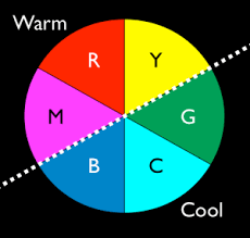
Double Click this image to watch a short video about the basic principles.
Discuss the colours used in terms of whether they are warm or cold? Is there a reason for using one of the other? Think too about the use of light - has this an overall affect on the colours in the images. Remember light is described in terms of being cold or warm - has the approach the photographer has used included making the images in a certain light in order to create an overall sense that the images are warm or cold - if so why? You could ask 'What if'? Type questions around this aspect of the images in order to take your up a level to include analysis. Looking at the images you're researching if warm or cold light/colour was applied how would this impact on the images?
Remember when you're looking at and discussing these aspects - write about them in terms of what if I applied this or a similar approach to my own work - how would it impact on my work?
Look at your research images and consider whether the photographer has used colour contrast in the images e.g. colours on the opposite sides of the colour wheel together to create an image that has dramatic use of colour that potentially works because of the stark contrast.
Look at the use of colour discord. This is the use of colours that don't work with each other and look wrong in the image. This may be a considered tactic used within the image to draw attention to something or add to the negative feel of the image.
Does the image use colour harmony - a series of colours that are of a similar grouping that work together and are visually pleasing. One of the most frequent used images that exemplifies this is autumnal leaves - combining oranges, reds, browns and yellows.
Look at images and say whether you think the photographer has chosen to saturate the colours if it's significant. Has the saturation been achieved - is it artificially done using post production methods (Photoshop or similar) or has the saturation occurred through the choice of light?
It may be that when you look at the images, there's little to say about the colours in which case explain why the significance of the colour is limited and move on to the next prompt.
https://www.youtube.com/watch?v=MFKvdidTVLc
Colour is such an important aspect of images, you do need to consider it's use carefully and the more you discuss it with a sense of real knowledge, the higher grade is likely to be.
Check out this website here and the links at the bottom relating to the connotations of colour http://www.bourncreative.com/meaning-of-the-color-black/.
Colour
Much of the photography you look at will be designed e.g. the photographer will make conscious decisions about the colour, whether they want the colour to be muted or vibrant, obvious or subtle. In other situations they may not have a great deal of say in the colours that appear in the image whether in foreground or in the background, but colour has the ability to ruin and image or make the image, so is a very important aspect of the image.
When you're looking at the photography that you're researching one of the easier things to discuss in your work and make sense of and critique is the colour. It helps if you have some background knowledge of how colour is used in Art generally and if you're looking at attain high grades it may be worthwhile doing some re-capping on basic principles in painting and colour psychology. Look to at how colour is perceived in other cultures and the significance of colour in other cultures.
Some of the questions you address in your analysis of the images you research might include the following...
If the image is a colour image - consider whether it would be improved by making it black and white? Think about what B&W images convey to the audience - why do people make black and white images or convert colour images to B&W sometimes? This has been discussed earlier in the year during your early visual language lessons.
Double Click this image to watch a short video about the basic principles.
Discuss the colours used in terms of whether they are warm or cold? Is there a reason for using one of the other? Think too about the use of light - has this an overall affect on the colours in the images. Remember light is described in terms of being cold or warm - has the approach the photographer has used included making the images in a certain light in order to create an overall sense that the images are warm or cold - if so why? You could ask 'What if'? Type questions around this aspect of the images in order to take your up a level to include analysis. Looking at the images you're researching if warm or cold light/colour was applied how would this impact on the images?
Remember when you're looking at and discussing these aspects - write about them in terms of what if I applied this or a similar approach to my own work - how would it impact on my work?
Look at your research images and consider whether the photographer has used colour contrast in the images e.g. colours on the opposite sides of the colour wheel together to create an image that has dramatic use of colour that potentially works because of the stark contrast.
Look at the use of colour discord. This is the use of colours that don't work with each other and look wrong in the image. This may be a considered tactic used within the image to draw attention to something or add to the negative feel of the image.
Does the image use colour harmony - a series of colours that are of a similar grouping that work together and are visually pleasing. One of the most frequent used images that exemplifies this is autumnal leaves - combining oranges, reds, browns and yellows.
Look at images and say whether you think the photographer has chosen to saturate the colours if it's significant. Has the saturation been achieved - is it artificially done using post production methods (Photoshop or similar) or has the saturation occurred through the choice of light?
It may be that when you look at the images, there's little to say about the colours in which case explain why the significance of the colour is limited and move on to the next prompt.
https://www.youtube.com/watch?v=MFKvdidTVLc
Colour is such an important aspect of images, you do need to consider it's use carefully and the more you discuss it with a sense of real knowledge, the higher grade is likely to be.
Check out this website here and the links at the bottom relating to the connotations of colour http://www.bourncreative.com/meaning-of-the-color-black/.
Subscribe to:
Posts (Atom)